This research investigates how integrating user-centred design with data storytelling elements creates compelling visualisation to improve trust in visual data analytics. This study focuses on creating visualisations that are both intuitive and trustworthy for the viewers. By involving stakeholders from early stage and incorporating interactive elements such as filtering, the report aimed to make data more accessible, helping users better understand and trust the provided insights.
Two case studies were analysed where stakeholders from the early stages with the use of tools such as Figma, Miro and Opendatasoft to create and prototype visualisations, enabling collaboration and iterative feedback. Two design options were presented, each using brand colours and specific design elements. To increase the clarity and credibility of the visual analytics we used consistent colour palettes, readable typography that meets WCAG guidelines and mentions the source of the data. Furthermore, interactions were added to promote a deeper comprehension of the given data insights.
For the first case study, stakeholders preferred the design that clearly distinguished “before” and “after” data and consistent use of colour with interactive options enhanced clarity, helping users engage with and understand the data narrative.
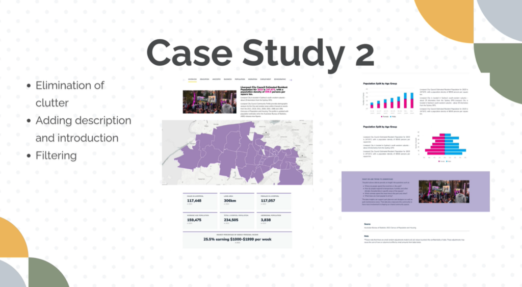
For the second one, the stakeholders preferred the design that had less clutter, filters and description for the visualisations which reduced the cognitive load.
This study shows that to provide reliable and compelling data visualisations, user-centred design and interaction are crucial. Clear data sourcing increases trust, while effective design minimizes cognitive load.